Signal Cartel Overview
-
Would it be possible to add the overview link to the message of the day, like the shared bookmarks link?
-
@Sir-Fiddle-Sticks
In the corporation MotD?
Maybe @Katia-Sae can answer that question, I don't know how tight we are on characters.
-
@Bernard-Lachapelle it would be nice especially for new members, but probably not a "must"

-
@Sir-Fiddle-Sticks it can currently be found in the corporation bulletins, the corporation description and hopefully the welcome mail; I agree with you that it would be nice though.
-
@Sir-Fiddle-Sticks @Bernard-Lachapelle So far I've got it added to the Public Corp Info page, Internal Corp Bulletin, and now the Corp in game channel MOTD. I'm leaning towards leaving it out of the Welcome mail as I feel this is more detailed information than is needed in the welcome and since we now have it in many other places.
Enjoy!
-
@Katia-Sae
Then with that done, deployment of this new overview is officialy completed!
-
FYI, also now up on the public namespace of the wiki and linked to the relevant sections

-
Stop me if this isn't the right place to ask, but what are the colors for hostiles in the overview? Is there a default color in EVE based on their status with us or their security status or anything?
-
@Soup-Atross That's a great question actually!
Friends come in many shapes and forms, namely blue, purple and green.
Foes come in two colours, yellow for 'neutrals' or red for wardeccers/bad/terrible standing.The default EVE color is no color, only the wee tiny icon in the bottom left of the icon would change color.

Yeah, it's that bad.
-
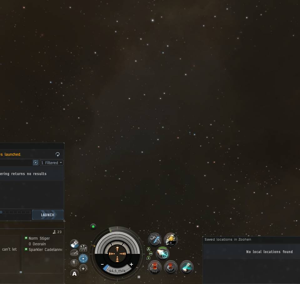
I have a question. With the old overview I was using, there was a small bracket around my own ship in the middle of the screen. Any idea where I can turn that back on? I really liked it as a point of reference

-
@O-Deorain Not sure what you mean, if I zoom out it's still there.
Are you talking about this?

-
Yes, that's the one! Gone missing for me...

-
Apologies... I started using ship type labels in space at the same time with the new CS overview and just found out that it's not the overview, it is this:
https://forums-archive.eveonline.com/message/6864253
"...all ship brackets will always show their own labels. However, also keep in mind that this option also disables the bracket for your own ship all of the time..."
-
I use the public overviews you know which one . I was so afraid to re-train my reactions via a new overview. I think I will give this a try Was your last corp email. Final installation ?
Best Regards,
DieNadel
-
@DieNadel The most up-to-date install instructions are found on the Signal Cartel Overview Pack wiki page based on @Bernard-Lachapelle's awesome work and latest tweaks. Check it out, and let me know if everything flows.

-
Overview has received its first round of update.
Wiki page should also have some nice screenshots for @a-dead-parrot very soon!
-
@Bernard-Lachapelle I have been using your overview since Beta and greatly appreciate the time and effort you have put in to it - the current version is awesome!
-
@Soup-Atross for what it is worth ...
You can even customize the SC overview to your liking! :gasp: I know, right! Who'd a thunk it! Mind. Blown.
The Eve defaults are really poor once you join a corp or leave hisec (example: security status is meaningless, unless the pilot is an outlaw). I chose overview settings to grab my attention when necessary.
TIP: You can change overview settings while docked if you map a key to open your overview!
Example of my choices, which likely differ from all other pilots in Eve:
-
Flashing anything is annoying as heck, so never blink the background, but icons flashing are less annoying, but should be used sparingly!
-
Hate > ... > family: red, orange, yellow, light blue, dark blue, green.
Most of Eve is yellow to me, neutral standing = intentions unknown. If it is in your fleet, standing doesn't matter ... unless you are at war, then that is a really odd situation. If it is orange, or 'bad' standing, I probably set that standing myself so as to beware of them (known pirate groups and such, CODE., Goons, etc.). Security status only matters if you can shoot it, or if it might shoot you.
- Colortags / icons tell me additional info. They are flashing if I need to pay attention to the icon.
Note that you can click-and-drag to change the priority of stuff. Highest priority at the top.
Overview 'states' are mucho advanced, and a great way to have ships shooting you but not appearing on overview. I don't recommend mucking with overview states unless you thoroughly understand them.
-
-
Having had to recover from a recent hard drive failure, and finding that my old overview (eve-uni) was not properly available (they upgraded and ruined it, in my humble opinion), I gave this a try, and it's great!
If it's missing something, I haven't yet figured out what. Congratulations and well done!
-
Yep, that's some good stuff, this overview! The only adjustment I made is to filter out all the ships in the "TRAVEL" tab - otherwise flying between Jita and Perimeter is a scrolling nightmare ))


